


Blog Post
Search Engine Optimization

Nadine
Wolff
published on:

Mobile vs. Responsive. What is better for my website?
Table of Contents
The number of mobile website visits has grown steadily over the last few years and has already surpassed desktop visits. On top of that, Google has rolled out several updates highlighting the importance of mobile websites. In April 2018, Google introduced another major update with the Mobile-First Index. Since then, the mobile version of a website is the first one added to the index.
Of course, almost any website can be displayed more or less correctly on a smartphone or tablet. However, a website that isn't mobile-friendly will appear very small, or elements like text and images might get cut off. Users have to "scroll" to the right to find the information they need, which quickly gets frustrating and, in the worst case, makes them leave the site right away. That's why a mobile-optimized website is becoming increasingly essential. When it comes to implementation, there are two common approaches—each with its own pros and cons.
[caption id="attachment_16718" align="aligncenter" width="614"]
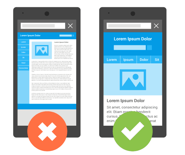
Fig. 1: Mobile display across different viewports[/caption]
What is Responsive Design?
Responsive design is a web development approach used to display websites seamlessly across devices. It allows pages to automatically adapt based on the properties of the user's device. The technology detects the client type (such as various smartphones with different screen sizes) and dynamically adjusts the layout to fit the screen. Essentially, it works with a column-based system: a three-column layout is typically used on desktops, a two-column format works great for tablets, and content appears in a single-column layout on smartphones.
What is a Mobile Website?
Mobile-dedicated websites are designed specifically for smartphones or tablets. They are usually accessible under their own domain or subdomain (e.g., m.website.com) and can be customized separately from the main website. They often include features or content elements that are considered ideal for mobile users, but might not be optimal for the desktop version.
When visitors access the site, their device automatically redirects them directly to the mobile site, or they are given a choice of which version they'd prefer to view. Alternatively, you can also offer a dedicated app for the website. Once installed, it can be launched directly. An app can drive stronger customer loyalty, as long as it provides real value to the user. When deciding on an app, several factors come into play, and the effort involved shouldn't be underestimated.
[caption id="attachment_23731" align="aligncenter" width="373"]

Fig. 2: Example of the LinkedIn app[/caption]
Additionally, specific adjustments need to be made for search engines so that the mobile website can rank directly in the SERPs and build organic reach. Without these configurations, search engines might flag the mobile site as duplicate content and exclude it from the index. For one, the canonical tag on the mobile page must point directly to the corresponding desktop version. In addition, a link tag must be included in the website's head section that points from the desktop page to the mobile page using rel="alternate".
Important: These settings must be configured on a page-by-page basis.
This means the subpage www.website.com/page-1/ points via a link tag to m.website.com/page-1/, which in turn points via a canonical tag back to www.website.com/page-1/.
With the Mobile-First Index, additional factors have become important. For example, structured data and content should be identical to the desktop version. Otherwise, you risk losing mobile ranking positions.
Responsive Design or Mobile Design?
There is no one-size-fits-all answer to which format is better. The optimal setup always depends on your business and your target audience. Ultimately, the most important goal is reaching your audience in the best way possible. If you receive a high volume of mobile traffic, a separate mobile site could make a lot of sense. If your visitors return frequently, building your own app might even be the ideal solution.
Taking the time to understand your market and target audience is essential before choosing the right approach. Only with a solid concept can you build a sustainable strategy.
The big advantage of responsive design is how easy it is to maintain. Instead of managing two separate websites, you only need to keep one updated both content-wise and technically. Google also recommends this approach because it's much less prone to errors. However, because it is a universal solution, individual customizations for mobile can be somewhat limited, and there's a slight risk that mobile users won't get the absolute best experience.
The key benefit of a mobile subdomain is full customization. You can tailor the page specifically to what works best for your target audience, without affecting the desktop version at all. However, maintenance requires considerably more effort, as you effectively have to manage two domains. Furthermore, you need to set up the technical foundation properly so Google crawls the site accurately without treating it as duplicate content. Small mistakes can lead to major deindexing issues and ranking drops. Regardless of which option you choose, here are a few more important aspects to keep in mind:
Mobile Page Speed
Alongside the Mobile-First Index, Google established mobile page speed as a direct ranking factor. Attention spans are notoriously short on mobile devices, which can quickly lead to higher bounce rates or lower conversion rates.
To help with this, Google improved its own PageSpeed Insights tool to help identify key bottlenecks. Conveniently, the report checks both the mobile and desktop versions. Important: The test only evaluates the specific URL entered. If you use a separate subdomain for mobile visitors, be sure to enter that mobile URL.
Google has also rolled out its own initiatives, such as the AMP project, to help boost mobile website speeds.
Mobile-Friendly Test
Once you've built your mobile website, it's crucial to test it for key performance and usability factors. With a responsive website, you generally don't need to re-evaluate on-page factors; the focus is primarily on usability. Another handy tool from Google is available for this, and you can also find helpful insights directly in Google Search Console.
With a dedicated mobile site, on the other hand, you'll want to check both usability and all your on-page elements. You should focus especially on the following:
Structured data is correct and matches the desktop version
Page loading speed is optimized
On-page factors are taken into account
Proper links and tags connect it to the desktop version
Small errors here can significantly impact your mobile traffic and search visibility.
How We Can Help
Choosing the best mobile website setup involves looking at several factors: your market, your target audience, and your technical requirements all play a decisive role. Additionally, regularly testing and analyzing your mobile site should be a top priority, especially as search engines like Google continue to place heavy emphasis on mobile experiences.
We would love to provide you with holistic guidance, helping you avoid small oversights that could significantly hurt your mobile revenue. Feel free to reach out—we look forward to hearing from you via our inquiry form!
Nadine
Wolff
As a long-time expert in SEO (and web analytics), Nadine Wolff has been working with internetwarriors since 2015. She leads the SEO & Web Analytics team and is passionate about all the (sometimes quirky) innovations from Google and the other major search engines. In the SEO field, Nadine has published articles in Website Boosting and looks forward to professional workshops and sustainable organic exchanges.
