Blog Post
SEO

Nadine
Wolff
published on:
06.03.2019
Mobile vs. Responsive. What is better for my website?
Table of Contents
The number of mobile accesses to websites has been increasing more and more in recent years and is already greater than desktop accesses. Furthermore, Google has emphasized the importance of mobile websites with several updates. In April 2018, Google launched another update with the Mobile First Index. This means that the mobile view is first incorporated into the index.
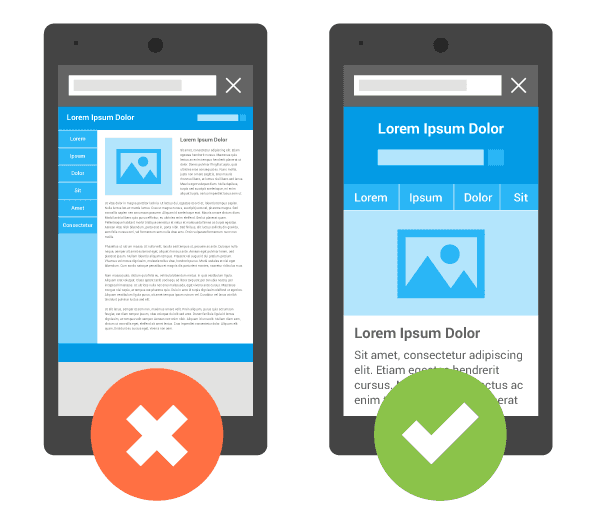
Of course, any website can be displayed more or less correctly on a smartphone or tablet. However, a non-mobile-friendly website is displayed very small, or elements like text or images are cut off. The user has to 'scroll' to the right to get to the desired information, which can quickly make the user lose track and in the worst case leave the website directly. Therefore, a mobile-optimized website is becoming increasingly important. There are two common ways to implement this, each with its own advantages and disadvantages.
[caption id="attachment_16718" align="aligncenter" width="614"]

Fig. 1: Mobile display with different display areas[/caption]
What is Responsive Design?
Responsive design is a development technique for displaying websites. This allows adjustments to be made directly based on the properties of the end device. The technology recognizes the type of client (for example, different smartphones with different screen sizes) and dynamically presents the layout of the site according to the size of the screen. Basically, a columnar pattern is used here. On a desktop, the three-column format is used. The two-column format is suitable for display on a tablet. On smartphones, the contents appear in a single-column format.
What is a mobile website?
Mobile-supported sites are specifically designed for smartphones or tablets. They are usually accessible under their own domain (e.g., m.website.com) and can be adapted separately from the website. They often include features or content elements that are considered appropriate for the mobile version but are not optimal in the desktop version.
When accessing the website, the user is immediately directed to the pure mobile website based on their device, or they are given the choice of which version they would like to use. Alternatively, the corresponding app can also be offered for the website. If this is installed, it can be used directly. The app can lead to greater customer retention as long as it adds value for the customer. Several aspects are relevant when deciding on an app, and the effort should not be underestimated.
[caption id="attachment_23731" align="aligncenter" width="373"]

Fig. 2: Example LinkedIn App[/caption]
Furthermore, specific adjustments must be made for search engines so that the mobile website ranks directly in the SERPs and can build organic reach. Without these specifications the mobile website can be perceived as duplicate content and therefore not be included in the index. On the one hand, the canonical tag must refer from the mobile site directly to the corresponding desktop variant, and a link tag must be used in the head of the website that points from the desktop site to the mobile site using rel="alternate".
Important: These specifications must be made per page.
That means the subpage www.website.com/page-1/ points via link tag to m.website.com/page-1/ and this, in turn, points via canonical tag to www.website.com/page-1/
With the Mobile Index, further aspects have been added. The tags and the content should be identical to the desktop version. Otherwise, mobile ranking losses may follow.
Responsive Design or Mobile Design?
There is no general answer as to which format is better. The optimal landing page always depends on the company and the target audience of the website. In the end, it is most important to reach the target group as best as possible. With a large amount of mobile traffic, a separate mobile site would be very sensible. If the visits are frequent, a custom app might be the best solution.
Capturing the market and target audience is crucial before the optimal solution can be chosen. Only with the right concept can a sustainable strategy be enabled.
The advantage of responsive design is the low maintenance effort. Instead of maintaining two websites, only one needs to be kept up to date both in content and technically. Google also recommends this format because it is less prone to errors. However, due to the general solution, individual customization of the website is only possible to a limited extent. There is a risk that the user will not be optimally reached on mobile.
The advantage of the mobile subdomain is the individual customization. The site can be specifically tailored to how it works best for the target audience. The desktop version is not affected by this. However, the maintenance effort is significantly greater because ultimately two domains have to be adjusted. Furthermore, the technical requirements must be met so that Google correctly identifies the site and does not consider it duplicate content. Small errors can lead to major de-indexing and ranking losses. Regardless of the choice, other aspects should also be taken into account:
Mobile page load speed
With the Mobile First Index, the page load speed on mobile was defined by Google as a direct ranking factor. Especially mobile, the user's attention span is very low, which can lead to a higher bounce or conversion rate.
For this, Google has further developed its PageSpeed Insights Tool to find the biggest problem areas. The report appropriately tests both the mobile and desktop versions.Important: Only the entered URL is tested. If a separate subdomain exists for mobile accesses, this URL must be entered.
Google has also developed its own measures with the AMP project to improve the mobile speed of websites.
Mobile Friendly Test
After creating the mobile website, it is necessary to check it for the most important properties. For the responsive website, checking the on-page factors is not necessary. Here, usability is the focus. Another tool from Google is used for this purpose. Further information can be obtained from the Google Search Console.
For the custom mobile website, both usability and all on-page factors must be checked. The focus should be on the following aspects:
Structured data correctly and identical with the desktop version
Page load speed optimized
On-page factors considered
Link to the desktop version
Small errors can severely impact mobile access and visibility here.
What we can do for you
When choosing the best variant of the mobile website, various aspects must be considered. Both the market, the target audience, and the technical requirements are crucial here. Furthermore, regular check-ups and analysis of the mobile website should have high priority, since search engines like Google have significantly increased the focus here.
We are happy to advise you holistically because small errors can significantly reduce revenue from mobile access. We look forward to your inquiry!

Nadine
Wolff
As a long-time expert in SEO (and web analytics), Nadine Wolff has been working with internetwarriors since 2015. She leads the SEO & Web Analytics team and is passionate about all the (sometimes quirky) innovations from Google and the other major search engines. In the SEO field, Nadine has published articles in Website Boosting and looks forward to professional workshops and sustainable organic exchanges.


